


Once you figure out the rooms you need painted, usually the next question is “what color should I paint them?” Between current color trends and market appeal this is tough enough, but have you considered how the colors will actually make you feel? If you haven’t, this could be the deciding factor. Read on to learn why.
What can color do?
Color is the way that we see the world. It can:
- Affect your mood
- Reflect your personality
- Change the shape and size of furnishings
- Change the shape and size of the room itself
Should I Worry About Color Trends?
One of the problems that a lot of people have with color trends is that they tend to pick a certain style simply because it’s popular. A good way to deal with this issue is to go with a style you feel comfortable with while still being on trend.
Here are some reasons not to worry about color trends:
- Trends come and go
- Key is to blend colors you like into a pleasing combination
How To Choose Colors
Colors have a way of influencing how we feel, react and perceive the world. Depending on what you’re going for, different colors can go a long way in bringing out the mood you’re trying to set.
In order to find out which color is best for you or your project, here are some of the basic principles of color theory that can help you make a more informed decision.
- Start with the mood you want to create
- Determine what colors match that mood
Red, Red, Red
Red is a vibrant and powerful color. It screams attention, and can often be associated with danger. This is why so many people are drawn to the color red. The color doesn’t just convey feelings, it carries messages about safety, danger, caution, power, strength – even violence.
- Raises a room’s energy level
- Can stimulate love and passion
- Can stimulate Anger and Power
- It has been shown to reais blood pressure, respiration, and heart rate
- Can be good for an office if you’re in sales, bad for customer service
- Bad for kitchens. Leads to overeating
- Best for Entryways and dining/living rooms that are front rooms
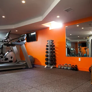
Orange You Glad You Painted?
Orange is the new color of interior design. The popularity of orange can be attributed to its versatility, gender neutrality and ability to uplift one’s mood while relaxing the nervous system.
- Evokes Excitement and enthusiasm
- Great for Playrooms, exercise rooms
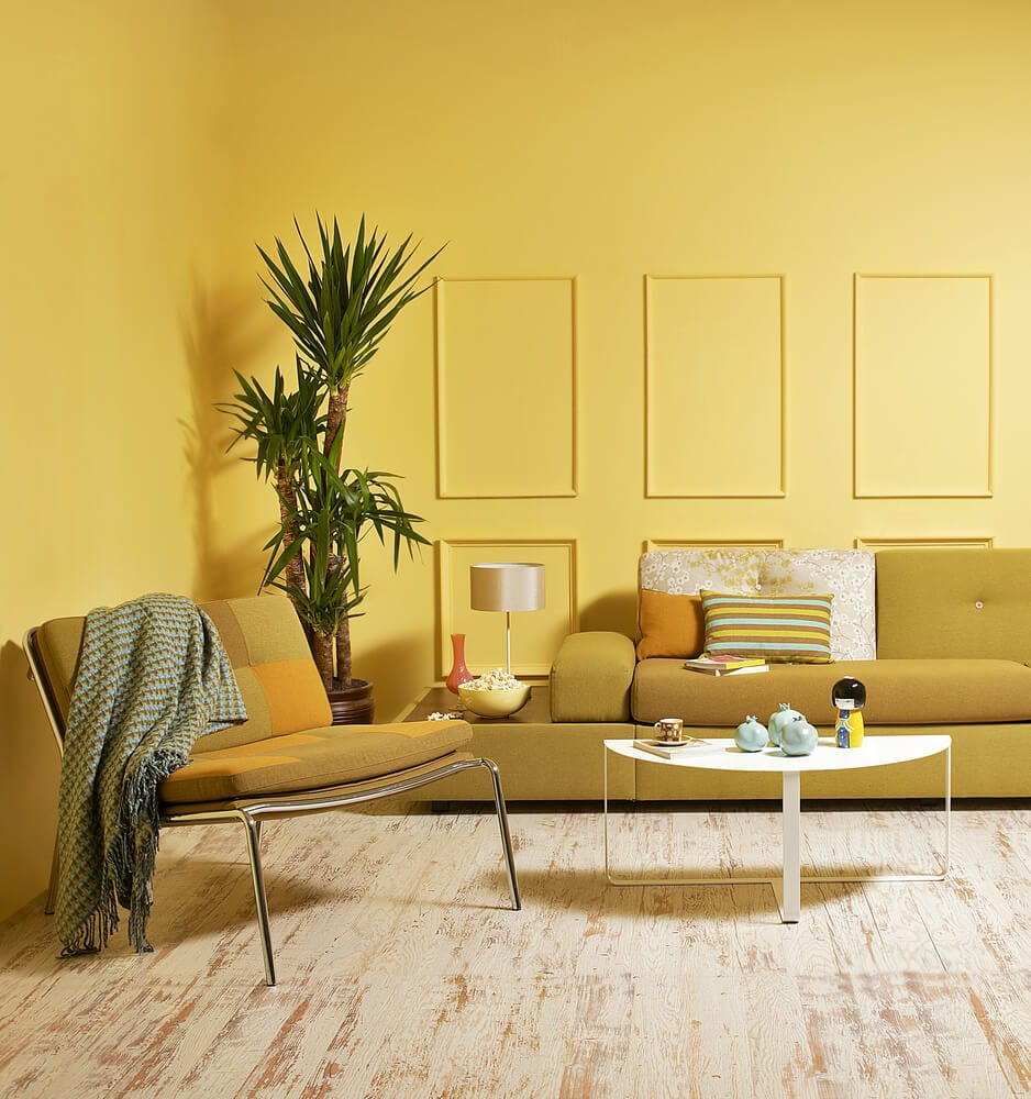
Yellow, The Color Of Happiness
The color yellow is associated with energy, creativity, and happiness. When you walk into a room with yellow walls:
- Captures the joy of sunshine
- Communicates happiness
- Good for living rooms that are not front rooms
- Good for kitchens(Often combo’d with living rooms)
- Good for dining rooms
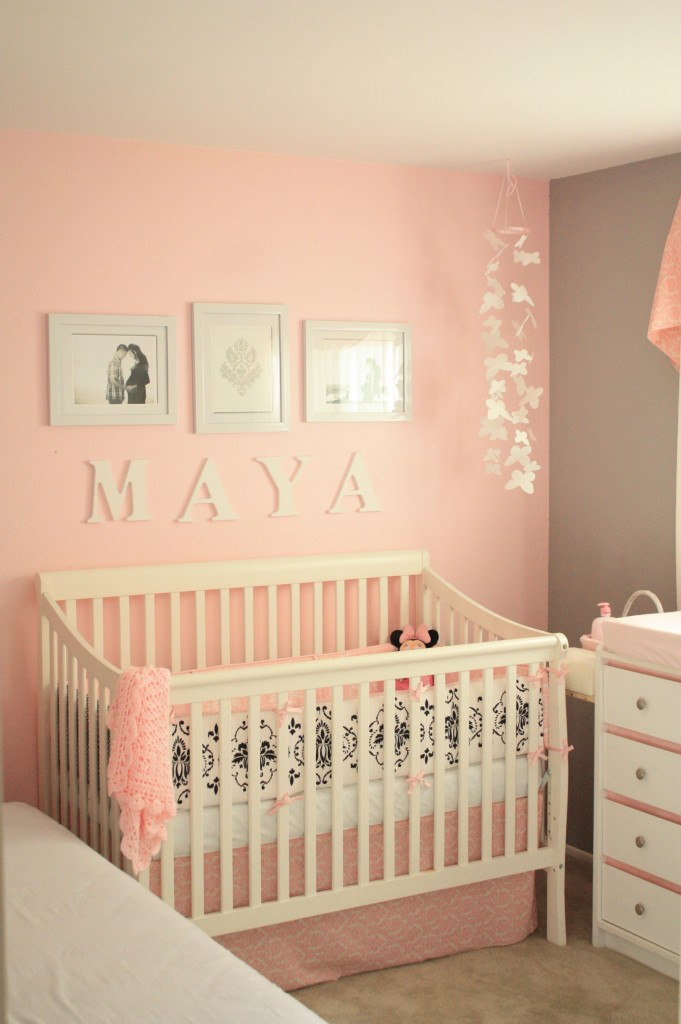
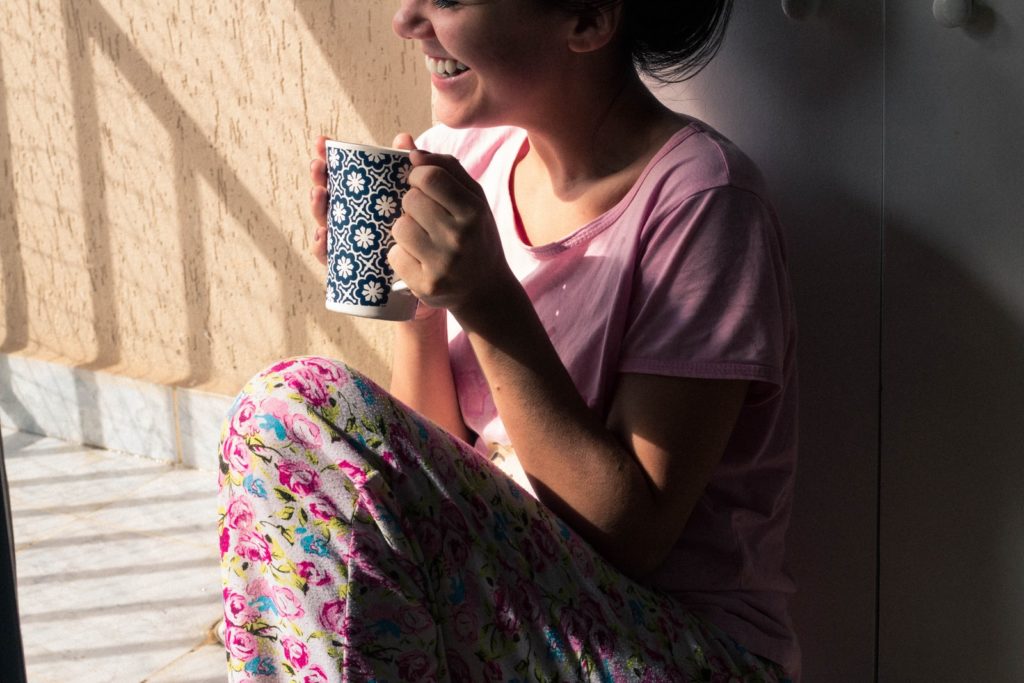
PINK – Or Salmon If It Makes You Feel Better(Guys)
PINK makes us calm and brings about a sense of emotional balance. It also creates a feeling of safety and security. The effect of pink on humans causes an increase in alpha waves , which can lower blood pressure and reduce stress. It also stimulates higher levels of serotonin, the hormone responsible for increasing happiness and reducing depression and anxiety.
- The calming color of love
- Associated with love and kindness
- Boosts creativity
- Good for offices, bedrooms, nurseries
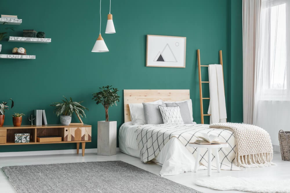
Green, The Restful Color
Green helps relieve stress. It’s said that spending time in a room with green helps people recover from stress more quickly, and that rooms painted entirely in green are conducive to relaxation.
- Has a calming effect
- Relieves stress
- Said to improve fertility
- Good for bedrooms, living rooms, kitchens
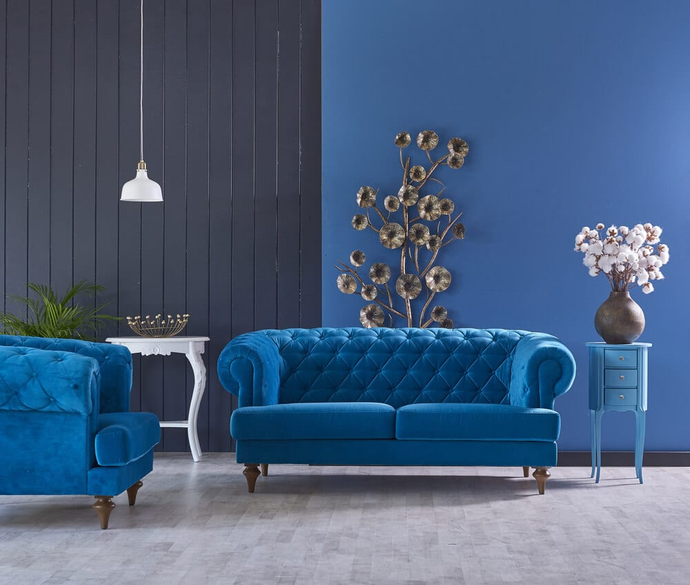
Blue, The Color Of Calm
The color blue is a calming color that calms the mind. It gives a sense of tranquility and peace to people close to it. Blue is a great color for a bedroom or bathroom because it gives off a relaxing vibe.
- Soothing
- Lowers blood pressure
- Slows respiration and heart rate
- Good for bedrooms, bathrooms
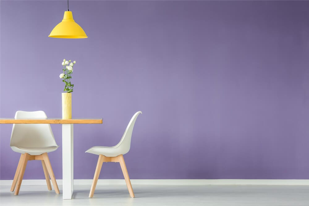
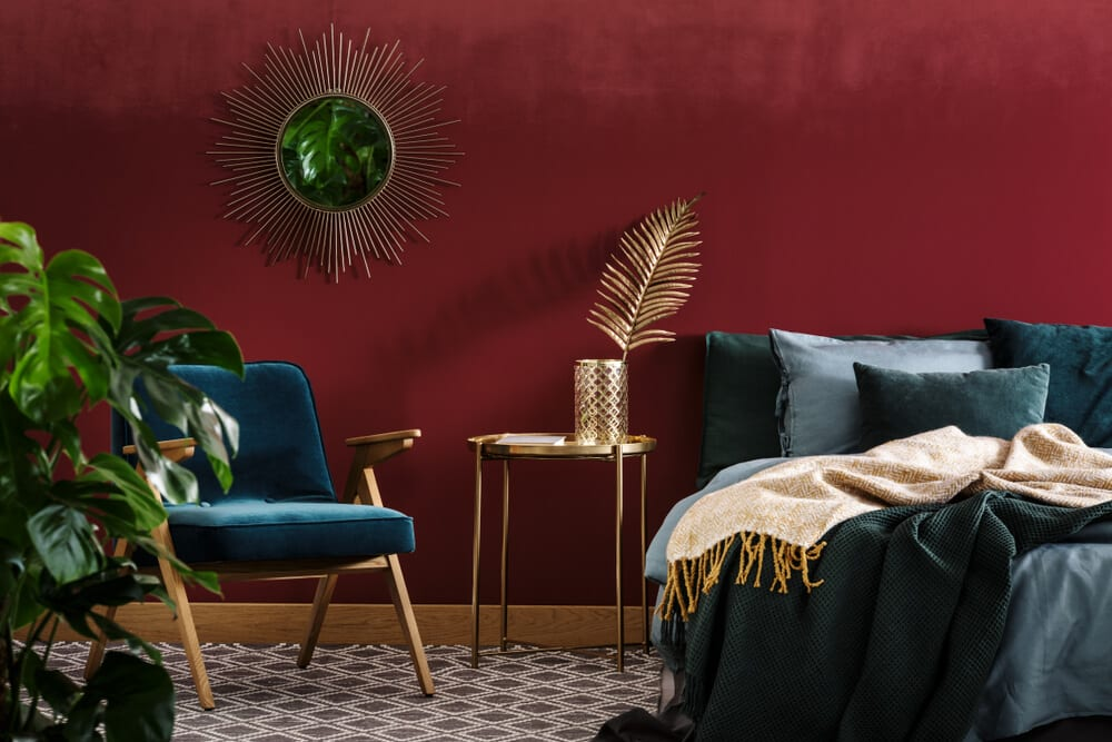
Purple, The Color Of Drama/Sophistication
Purple is the color of drama and sophistication. It has a rich, deep color that can be used to create a feeling of power. In contrast, it also creates a sense of elegance and glamor that can transform any space into something beautiful.
- Dark purples for sophistication
- Light purples for relaxation
- Bedrooms, offices, living rooms, massage rooms, wine/cigar rooms
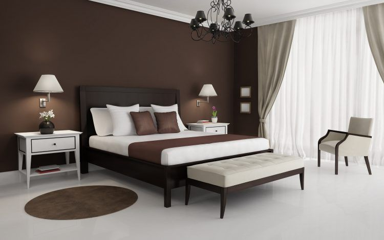
Brown, the Color Of Tradition
Brown creates a warm and inviting atmosphere where people feel comfortable and at ease. Brown can help people feel grounded and calm, since this color is similar to soil.
- Adds warmth
- Common with traditional decor
- Brings elegance and sophistication
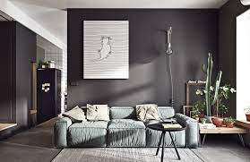

Grey, The New “In” Color
Grey is a color that never goes out of style. It is versatile, elegant and calms the senses. It can be both contemporary or classic depending on what you pair it with. Grey is also an excellent backdrop for pops of color. It goes well with almost anything and it adds sophistication to any home
- Completely versatile
- Brings comfort and warmth
- Timeless and classic in light shades
- Edgy and modern in darker hues
Whites – A Timeless Classic
White is a prismatic color. It’s warmth and brightness can affect your mood in your house positively.
- Brings calming effects
- Makes rooms feel more open and spacious
- Works in ANY room
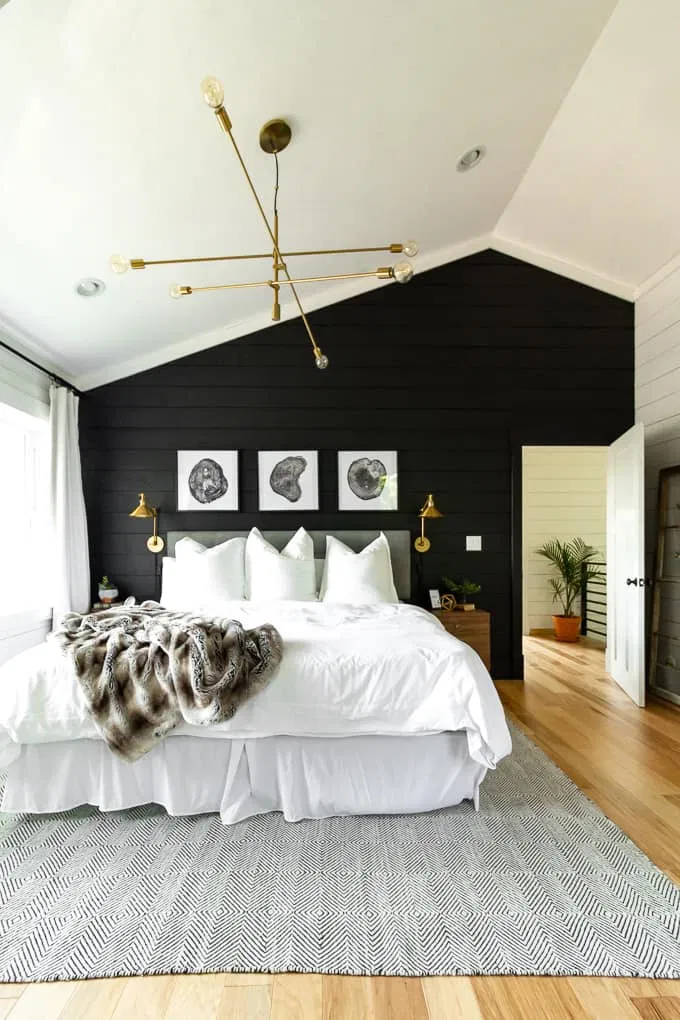
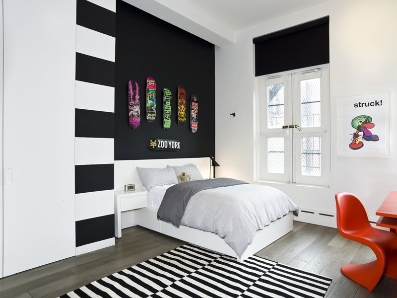
Blacks – A Bit Of Edge
Blacks are an elegant color, but they’re also a bit of an edge. This means that they can be used to create a mood for your house that is sophisticated, yet mysterious.
- Best used in small doses as an accent unless your child is going through a goth phase
- Can create depth as an accent wall
So what are the best colors for my bedroom?
You really can’t go wrong with any of the above colors! Just be sure to choose a color that you’re absolutely in love with because it will have an effect on your mood when you see it everyday.
Colors are always a very subjective thing, but the best colors to use are what you feel comfortable with. So don’t worry too much about if this is the right choice or not.. Just make sure the room feels like YOU.
- Green to relieve stress
- Blue to lower blood pressure
- Purple in lighter shades to create a relaxed feeling without it being too “cold”
- AVOID Orange and pastel blue
- If trying to get pregnant, apparently green and red are the key!
And my living room?
Living room color is often underestimated; however, it affects the mood for both better and worse. Some colors even encourage people to eat more than they should! It is important to take into consideration what color you want your living room in before choosing the paint or wallpapers.
- Red pumps the adrenaline and is great if you host parties often
- Green combines the refreshing quality of blue with the cheerfulness of yellow – think more netflix and chill
- Blue can encourage relaxation if its more of a sitting room or study
- AVOID orange – too energetic
Don’t stop now, what about the bathroom?
The bathroom has many functions—eliminating body waste, beautifying ourselves, etc. But one thing we never think about is how different color temperatures within such a small space can affect our mood and health until we go in there.
- Blue brings feelings of relaxation to your bath
- Yellow is uplifting, and great for parents where the only hiding place is the bathroom
- Purple is great for serenity – awesome if you have a bathtub that fits you
- AVOID – Red and orange. And although brown provides great camouflage in the case of a horrific accident, I still advise against it.
What about the kitchen?
While kitchen designs are always attractive, it is important that you choose colors that can mesh well with your lifestyle. It is also important to understand what message certain colors may communicate about your cooking prowess or lack thereof!
- Yellow is energizing and great for cooks
- Green makes the kitchen feel cozy and fantastic for family dinners
- Warm blue promotes relaxation if its the first place to go when you come home from work
- Purple is sophisticated, for those of you whose dinner consists of wine and string cheese
- AVOID – Black – can impact conversation negatively with how sharp it is and brown because it is often associated with hunger.
And the dining room?
Choosing a dining room color is not as simple as it seems. You need to remember that whatever color you choose, it will have an impact on the mood of everyone around the table. In order to get new ideas for decorating your dining room, below are some suggestions on what color reflects certain moods best.
- Red draws people together in conversation
- Yellow adds positive energy
- Purple brings luxury
- AVOID – blues are too sleepy, reducing your appetite. Greens are too energizing, leaving you less inclined to eat
THE BOTTOM LINE
Room color can have a profound effect on an individual’s mood.
When looking at different colors and what they mean, experts say that purple represents knowledge and passion; orange means comfort and affordability; blue symbolizes security; yellow signifies happiness; black represents power; brown is cozy; white stands for peace; gray is versatile; pink represents love and romance; red embodies courage and strength.
It’s important to consider the different meanings behind each color to ensure you’re creating the best atmosphere for your home or office by using the right hues. By understanding each shade’s impact on moods, you can create an environment that best suits your personality or family