Imagine stepping into a room and feeling like the sun decided to make a special appearance just for you. That’s the power of choosing the right paint color to brighten up a space that otherwise feels like a cave. Whether your room lacks natural light or you’re just looking to inject a dose of cheerfulness, the perfect paint shade can transform your space from gloomy to glowing.
But with the endless palette options out there, picking the right hue can feel as daunting as finding a needle in a haystack. Fear not! We’ve scoured the wisdom of top home improvement gurus and color connoisseurs to bring you a curated list of paint color ideas guaranteed to light up any room. From the soft glow of pastel hues to the vibrant energy of bold tones, prepare to turn the light on in your home, metaphorically speaking. Let’s dive into the spectrum of colors that promise to brighten your days, one brushstroke at a time.
Grays:
Light Gray:
This color acts as a grounding force, softening the starkness of an all-white space without overwhelming it. Ideal for minimalists, light gray is a cooler neutral that strikes a balance between coziness and spaciousness, allowing it to enhance the appearance of darker decor items.
Shades to try:
Clare Windy City:
This matte finish paint is perfect for creating a serene and sophisticated ambiance in living rooms and bedrooms. Its ability to balance out the brightness of an all-white space while still keeping the room feeling open and airy makes it a favorite among minimalists. The cool undertones of Windy City also provide a stunning backdrop for darker furniture and decor, allowing them to stand out.
Sherwin-Williams Drift of Mist:
Available in a range of finishes from matte to gloss, Drift of Mist adapts well to different surfaces, including walls, ceilings, and trim. Its versatility is matched by its subtle warmth, which can make any space feel more inviting. This shade is particularly effective in rooms that seek a balance between coziness and spaciousness.
Magnolia Loft:
Typically used in an eggshell finish, Loft is ideal for areas that require durability without the high shine, such as kitchens and bathrooms. The finish is easy to clean and resists common kitchen and bathroom stains, making maintenance a breeze. Its neutral tone complements a wide range of color palettes and decor styles.
Soft Gray: Soft gray is a versatile neutral that reflects light, contributing to a sense of airiness and brightness in a room. It is particularly effective in north-facing rooms, where little natural light is limited.
Benjamin Moore Revere Pewter:
This shade is often chosen in a satin finish, striking the perfect balance between a matte look and a slight gloss. Revere Pewter reflects light beautifully, enhancing the natural brightness of a room, especially in north-facing rooms where light can appear cooler. Its warm undertones make it a versatile backdrop for various decorating styles, from contemporary to traditional.
Neutrals
Taupe:
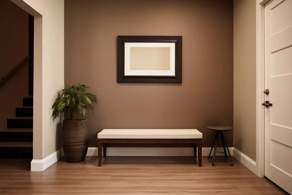
A warmer alternative to light gray, taupe can make spaces appear both brighter and taller. It’s particularly effective when used in a half-and-half look with white, adding depth while maintaining a light, airy feel.
Shades to try:
Benjamin Moore Stone Hearth:
An eggshell finish gives Stone Hearth a subtle sheen that is both durable and washable, making it an excellent choice for living rooms and dining areas. Its warm undertones create a cozy atmosphere, while the finish itself is resilient enough to handle the hustle and bustle of a busy household.
Farrow & Ball Oxford Stone:
This paint is often applied in a modern emulsion finish, known for its mold-resistant and washable properties, making it perfect for kitchens, bathrooms, and other high-moisture areas. Oxford Stone’s rich depth adds warmth to spaces, while its finish ensures longevity and ease of maintenance.
Valspar Badlands Taupe:
The satin finish of Badlands Taupe offers a smooth application with a slight sheen that beautifully reflects light, making spaces appear brighter and more welcoming. It’s an ideal choice for bedrooms and living areas, where its warm tones can create a soft, inviting ambiance.
Mint Green:
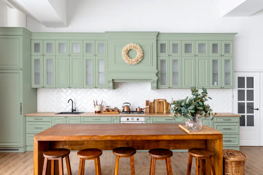
Shades to try:
Magnolia Texas Summer:
With a matte finish, Texas Summer provides a soft, powdery look that’s perfect for creating a calming atmosphere in bedrooms and nurseries. The paint’s light-reflecting properties enhance the natural brightness of a space, making it feel airy and fresh.
Kilz Budding Green:
This shade is often used in a semi-gloss finish for trim and doors, offering a durable surface that stands up to frequent cleaning. Budding Green’s vibrant tone brings a lively burst of color to any room, making it a great choice for adding character to more neutral spaces.
Behr Misty Meadow:
Recommended in an eggshell finish, Misty Meadow is ideal for living areas and bedrooms. The finish offers a balance between a matte look and a subtle sheen, hiding imperfections while brightening the room. Its gentle hue contributes to a serene and inviting atmosphere.
Blues
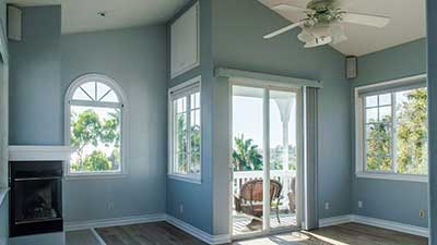
Powder Blue:
A joyful and calming pale hue of blue that visually opens up a room. It’s light enough to avoid the overwhelming effect of darker blues, making it a serene choice for bedrooms and living spaces alike.
Shades to try:
Farrow & Ball Borrowed Light:
This delicate shade is often applied in an estate emulsion finish, known for its very matte and chalky look. Borrowed Light is perfect for creating a tranquil and airy atmosphere in bedrooms and living rooms, reflecting natural light to make spaces appear larger. The finish is particularly suited to period properties and those looking for a soft, traditional aesthetic.
Backdrop On Tour:
Chosen in a low sheen finish, On Tour is ideal for walls in high-traffic areas, offering a balance of durability and a subtle glow. This light blue shade can make small spaces feel more open and larger, while its finish ensures it can withstand the rigors of daily life, making it a practical choice for busy families.
PPG Dartmoor Mist:
This shade is typically selected in a satin finish, providing a versatile look that works well in both traditional and contemporary spaces. Dartmoor Mist’s pale blue hue brings a sense of calm and openness to rooms, such as bathrooms and kitchens, where its finish offers a balance between easy cleaning and a soft aesthetic appeal.
Pinks
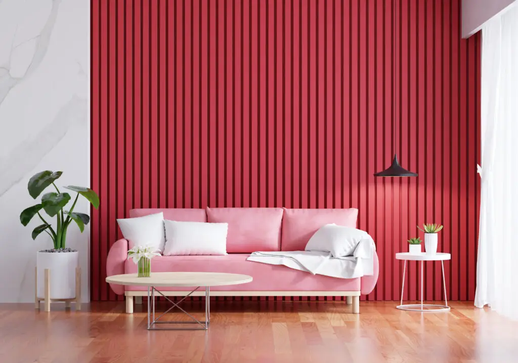
Light Pink:
This powdery hue adds more personality to a room than plain white, creating a sense of spaciousness. It’s a subtle way to introduce color into a space without dominating the decor.
Shades to try:
Behr Cupcake Pink:
A satin finish makes Cupcake Pink a durable and cleanable option, perfect for nurseries and playrooms where a soft, inviting color is desired. The finish reflects light gently, enhancing the room’s natural brightness while providing a surface that’s easy to keep looking fresh.
Sherwin-Williams Intimate White:
Often used in a matte or eggshell finish, Intimate White creates a soft, romantic ambiance in bedrooms and living rooms. The finish helps to diffuse light evenly, softening the space and making it feel warm and welcoming. Its subtle pink tone adds a touch of color without overwhelming the room’s decor.
Farrow & Ball Peignoir:
Recommended in a modern emulsion finish, Peignoir is durable and washable, making it suitable for high-traffic areas like hallways and family rooms. This soft, muted pink has a sophisticated edge, providing a tranquil backdrop that complements a wide range of interior styles.
Oranges
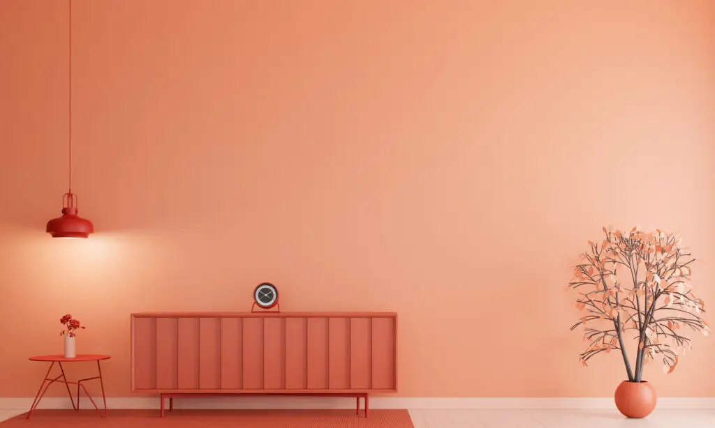
Shades to try:
Kilz Desert Vista:
Applied in a semi-gloss finish, Desert Vista is perfect for kitchens and bathrooms where its durability and easy-to-clean surface are essential. The vibrant orange hue adds warmth and energy to spaces, making them feel more inviting and lively.
Clare Sriracha:
A matte finish on Sriracha offers a bold, vibrant look without the overwhelming shine, making it suitable for living rooms and dining areas where a statement wall can create a focal point. The finish absorbs light, giving the color depth and reducing glare.
Valspar Champagne Orange:
The satin finish of Champagne Orange is ideal for bedrooms and living spaces, where its warm glow and slight sheen can create a cozy atmosphere. This finish strikes a perfect balance between reflecting light to brighten the room and providing a durable surface that’s easy to maintain.
Yellows
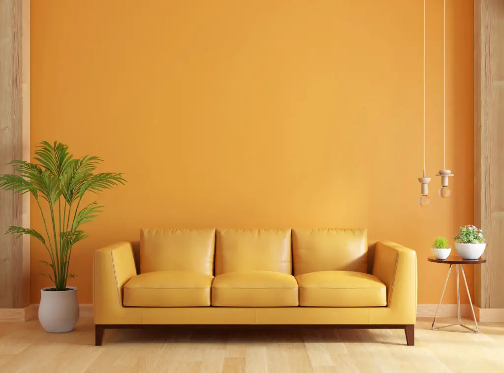
Ideal for gently brightening a room, soft yellow brings an eternally cheerful and vibrant tone. It’s perfect for guest bedrooms and basement areas, adding a sunny disposition.
Shades to try:
Backdrop Miami Parasol:
Chosen in an eggshell finish, Miami Parasol is perfect for brightening living rooms and kitchens. The finish offers a cheerful ambiance without the high shine, making it easier to live with day to day. Its light-reflecting properties help to make spaces feel more open and airy.
Graham & Brown Wild Rye:
A matte finish gives Wild Rye a soft, subtle look that’s ideal for creating a warm and inviting space in bedrooms and nurseries. The paint’s finish minimizes light reflection, which can help to soften the overall effect of the yellow, making it more soothing to the eye.
Behr Vanilla Ice Cream:
Recommended in a satin finish, Vanilla Ice Cream is suitable for hallways and common areas where its durability and light-reflecting properties can make spaces appear larger and more welcoming. The soft yellow hue adds a gentle warmth to the room, enhancing its inviting feel.
Whites
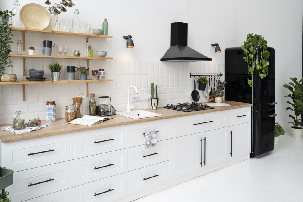
Bright White:
This color is inherently bright and capable of reflecting light, with various hues offering different undertones to achieve specific effects. It’s a versatile choice for any room, enhancing brightness and a sense of space.
Shades to try:
Clare Fresh Kicks:
This crisp, clean white is typically used in a matte finish, ideal for creating a bright, expansive feel in any room. The matte finish helps to hide imperfections on walls and ceilings while reflecting light softly, making the space feel larger and more open.
Benjamin Moore White Diamond:
Often selected in a semi-gloss finish for trim and doors, White Diamond provides a durable and reflective surface that contrasts beautifully with matte wall finishes. This bright white helps to define spaces clearly, adding a crisp, clean edge to the room’s decor.
Valspar Ultra White:
Available in a satin finish, Ultra White is perfect for kitchens and bathrooms, where a balance of durability and a slight sheen is desired. The finish is easy to clean and helps to reflect light, making the space feel brighter and more spacious.
Conclusion:
In conclusion, when considering paint colors to brighten a room while fostering an environment conducive to both focus and relaxation, several options stand out. For dark spaces with limited natural light, opting for neutral paint colors can help to amplify the available brightness and create a more inviting atmosphere. In areas with much natural light, such as a living room, selecting light colors like soft yellows or bright whites can further enhance the sense of spaciousness and tranquility. These hues not only reflect light effectively but also provide a calming backdrop for various activities, promoting both productivity and relaxation. Therefore, for a balanced approach to brightening and enhancing a room’s ambiance, consider incorporating neutral tones or light-colored paints that compliment the space’s lighting conditions and encourage focus and serenity.

