Best Paint Color For South Facing Room
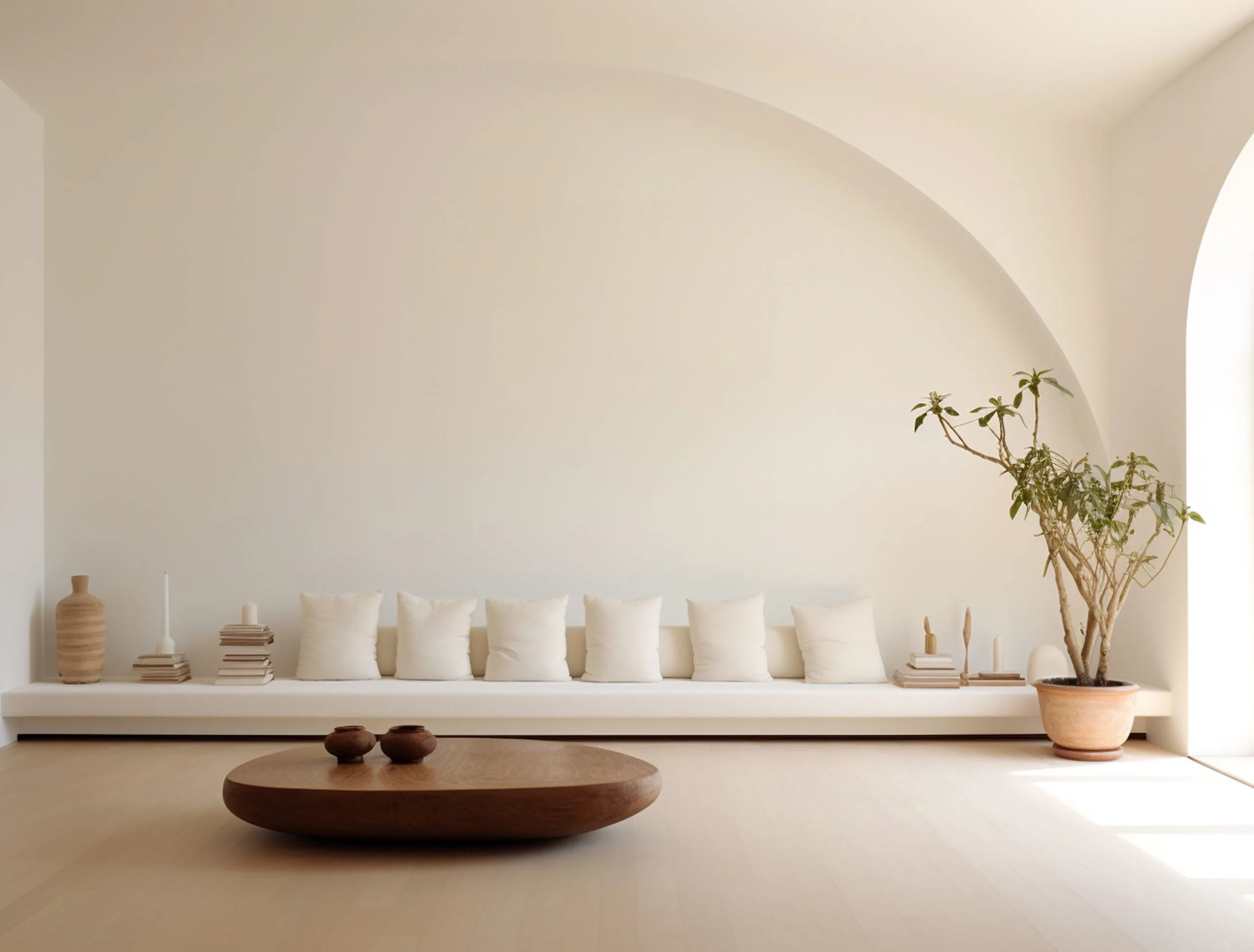
Crafting the perfect ambiance in a south-facing room is akin to a fine artist selecting their palette: it requires insight, nuance, and a touch of whimsy. South-facing rooms are the canvas where light dances throughout the day, offering a unique opportunity to harness this luminosity to its fullest potential. The right paint color doesn’t just adorn walls; it transforms spaces, influences moods, and acts as the backdrop to our lives.
From the soft glow of morning light to the golden hues of the afternoon, we’ll guide you through a curated selection of paint colors that promise to breathe life into your south-facing sanctuary. Whether you’re a minimalist at heart or a lover of bold statements, prepare to be inspired by a spectrum of colors that will elevate your home from ordinary to extraordinary. Let’s embark on this colorful journey together, where every stroke of the brush is a step towards creating a room that not only looks good but feels right.
Whites
Chantilly Lace (OC-65) by Benjamin Moore:
This paint color is a quintessential bright neutral with a subtle cool undertone, making it almost indistinguishable from pure white in a well-lit, south-facing room. Its light-reflective quality enhances the natural sunlight, creating a vibrant and fresh atmosphere that feels both welcoming and expansive. Chantilly Lace’s versatility makes it an excellent choice for any room, complementing both modern and traditional decor seamlessly.
Decorator’s White (OC-149) by Benjamin Moore:
Decorator’s White offers a sophisticated blend of white with cool grayish undertones, providing a medium-light depth that stands out particularly well in south-facing rooms. This shade is slightly darker than Chantilly Lace, which adds a layer of complexity and style, making it ideal for spaces that aim for a chic, polished look. Its ability to reflect light while maintaining a subtle depth makes it perfect for walls, trim, and ceilings alike.
Snowbound (SW 7004) by Sherwin-Williams
Snowbound is a soft, medium-light white that carries a hint of silver-gray, giving it a slightly warm undertone despite its brightness. This color is celebrated for its adaptability and the way it complements south-facing natural light, ensuring spaces feel open yet cozy. It’s particularly effective in creating a serene and inviting environment, suitable for living rooms and bedrooms where warmth and light are desired.
Off-Whites
Cloud Cover (OC-25) by Benjamin Moore
Positioned as a very light greige, Cloud Cover integrates blue-gray undertones into a medium bright off-white base, making it an exceptional choice for south-facing rooms. This color captures and diffuses the abundant natural light, ensuring the space remains bright yet balanced. Its cool, airy feel introduces a sense of calm and spaciousness, ideal for creating a tranquil retreat.
Zurich White (SW 7626) by Sherwin-Williams
Zurich White is a nuanced off-white with considerable depth, marked by its cool undertones that make it a standout in Sherwin-Williams’ collections. This color thrives in south-facing rooms, where it reveals its full complexity and charm, offering a backdrop that feels both sophisticated and inviting. Its ability to play with light makes it a versatile choice for any space, enhancing architectural details and complementing a wide range of decor styles.
Grays
Gray Owl (OC-52) by Benjamin Moore
Gray Owl is a medium-light gray that strikes a perfect balance between neutral and cool tones, with a subtle infusion of gray-green that adds an unexpected depth. In south-facing rooms, it transforms with the light, offering a backdrop that is both dynamic and soothing. This color’s versatility makes it a favorite for designers, adaptable to various settings from contemporary to traditional.
Edgecomb Gray (HC-173) by Benjamin Moore:
Edgecomb Gray is a light greige that beautifully melds gray and beige, achieving a warmth that is both inviting and versatile. This color is particularly effective in south-facing rooms, where it can soften the abundance of natural light, creating a cozy, harmonious space. Its balanced undertone ensures it pairs well with a wide range of color palettes, making it a go-to choice for creating a cohesive look throughout the home.
Neutrals
Mulberry Wine 1251:
Mulberry Wine 1251 is a choice for adding moodier, darker colors into south-facing spaces. It’s a rich, deep hue that can bring warmth and depth to a room, perfect for creating a focal point or accent wall. Neutrals like this work well in dining rooms or living areas, where they can add a sense of drama and elegance. A satin finish can enhance the color’s depth and make cleaning easier in high-traffic areas.
Evening Dove 2128-30:
Evening Dove 2128-30 is another color recommended for south-facing rooms, likely providing a darker, more dramatic effect compared to lighter grays and whites. This color is ideal for bedrooms or living spaces where a cozy, enveloping feel is desired. The finish choice could range from matte for a modern look to eggshell for a slight sheen that adds dimension.
General Recommendations for Finishes and Applications
Whites and Off-Whites:
Finish: For walls, an eggshell or matte finish is often preferred in living spaces due to its subtle sheen and ease of maintenance. It reflects light softly, enhancing the room’s natural brightness without the glare that glossier finishes can produce. For trim and moldings, a semi-gloss finish is typically used because of its durability and the slight contrast it offers against the less reflective wall finishes.
Application: Whites and off-whites like Chantilly Lace OC-65 are incredibly versatile and can be used across all room types, from kitchens and bathrooms to bedrooms and living areas. They are particularly effective in south-facing rooms for amplifying natural light streaming, making the space feel larger and more open, and can also adapt well to north facing rooms where the cooler, warmer light is beneficial.
Grays:
Finish: Gray paint colors, including grays, work well in both matte and eggshell finishes for walls, depending on the desired ambiance. Matte finishes offer a modern, sophisticated look, while eggshell adds a bit of luster and depth to the color, making cleaning easier. For areas that require more frequent cleaning, such as kitchens and bathrooms, satin or semi-gloss finishes are advisable.
Application: Gray tones, suggested for south-facing rooms without specific names, can serve as a neutral backdrop that complements both vibrant and subdued color schemes. They’re suitable for any room, providing a timeless elegance that works well with contemporary, minimalist, or classic decor styles, and are effective in balancing warm natural light.
Neutrals and Deeper Hues:
Finish: Neutrals and deeper hues like Mulberry Wine 1251 and Evening Dove 2128-30 benefit from a variety of finishes, from matte for a contemporary feel to satin for a bit of warmth and depth. The choice of finish can significantly affect the color’s appearance and the room’s overall mood.
Application: These richer, moodier colors are excellent for creating accent walls, cozy nooks, or dramatic entryways. They can also add depth and character to dining rooms, libraries, or bedrooms, especially when used on a feature wall or in combination with lighter tones for balance. Neutral paint colors and deeper hues can introduce a sense of sophistication and are versatile enough to complement both cool colors and warm tones, enhancing the natural light streaming in from south-facing rooms.
Additional Tips for South-Facing Rooms:
- Test Samples: Before committing to a full room, test large paint samples on the walls to see how the color looks throughout the day. South-facing light can significantly change the appearance of colors.
- Consider Decor: Align your paint color choice with your room’s existing or planned decor. Ensure the paint color complements your furniture, textiles, and overall design theme.
- Balance with Accessories: Use rugs, curtains, cushions, and artwork to balance the room’s color scheme. Accessories can add splashes of color or neutralize a room if the paint color is bold or dramatic.
Conclusion:
In summary, the selection of paint colors for south-facing rooms should prioritize personal style and comfort, ensuring the space reflects your unique identity and serves as a personal haven. Technical considerations, such as the impact of natural light and the choice of finishes, are important, but the essence of your decision should be rooted in what brings you joy and tranquility. Experiment with paint samples to see how they interact with the changing light in south-facing rooms and ensure they harmonize with your decor.
By focusing on your personal aesthetic and how the colors make you feel, you’ll create not just a visually appealing space but a true sanctuary that enhances your well-being and reflects your individuality.

Chris Heerdegen
Chris Heerdegen is the founder and owner of OnDemand Painters, a painting and finishing company serving six metro markets across the Midwest and Florida. With over 20 years in the industry since 2001, Chris built OnDemand around a simple idea: answer the phone, show up when you say you will, and do the kind of work that earns a review.
All Posts