


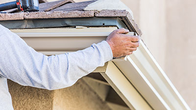

See the Best Interior Paint Colors for 2024
When it comes to paint colors, there are always new trends every year. Some colors are more popular than others, but there is no one “right” color that everyone should use. It’s important to choose a paint color that matches your personal style and the vibe you’re going for in your home.
Some of the most popular paint color trends for 2022 include grays, blues, whites, yellows, reds, greens, browns and neutrals. However, it’s important to keep in mind that these are just trends and you should choose a color that you love and feel comfortable with. Major paint companies like Sherwin-Williams, Benjamin Moore, and Behr all have their own palette of colors that they recommend.
Read OnDemand Painters’ paint color trend report and see the paint colors that are popular for 2022.
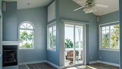
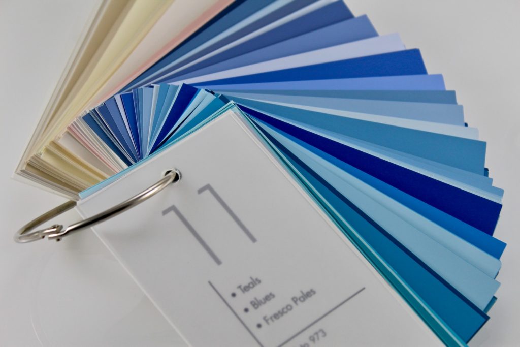
BLUE
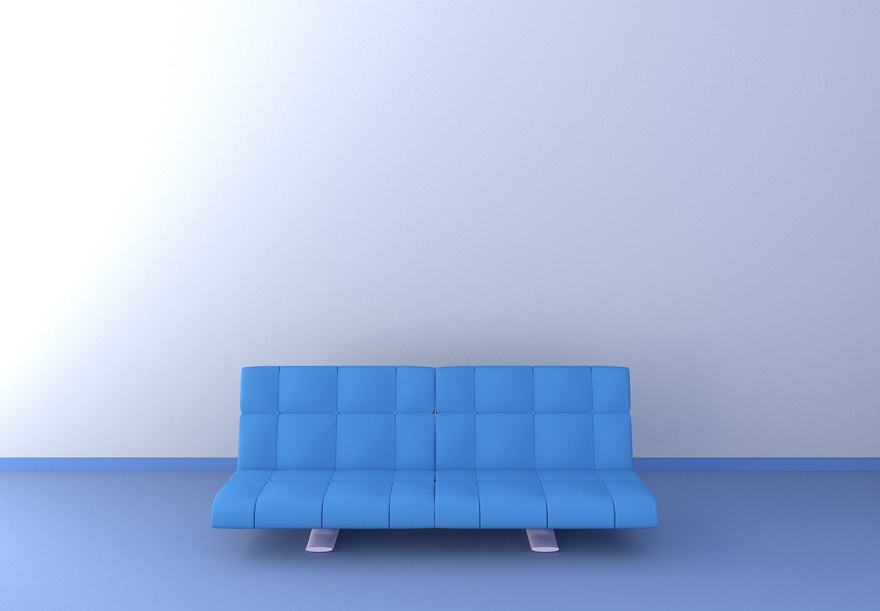
The paint color blue has always been seen as a symbol of trust, loyalty, and security. This is why it is often used in the interior design of banks and other financial institutions. It can also be calming and reassuring in a home environment. Blue is often recommended for bedrooms, as it helps promote relaxation and sleep.
Very Peri by Pantone color institute- PANTONE 17-3938 Very Peri
This blue shade is a perfect example of a color that can be both exciting and calming. It reminds us of the ocean, with a certain ease about it. Very Peri is THE color of the year and will make an excellent accent or accessory color for almost any room in your home.

HGTV Home by Sherwin-Williams’ Aleutian (HGSW 3355)
This shade of blue embodies the concept of “home”. The warm undertones encourage feelings of comfort and approachability, all while remaining cool to the touch. This color would work very well behind an accent wall or even just added in smaller touches throughout your home to instantly add a cozy vibe.
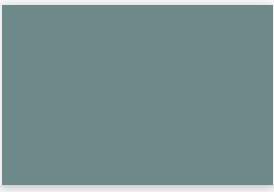
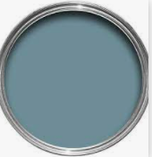
October Mist by Benjamin Moore Aegean Teal (2136-40)
October Mist is a rich, aquamarine blue that evokes feelings of relaxation and rejuvenation. This color will add some flair to your family room or kitchen without being too loud. It also works well with lighter neutrals for pops of color throughout the home.
Bright Skies – the hopeful blue
This shade of blue is perfect for whenever you are feeling down. The cool undertones give an uplifting feeling while still feeling soothing on the eyes. As if that isn’t enough reason to use it in your home decor, Bright Skies also works wonderfully as a natural color for backgrounds on your computer or phone.

Stone Blue by Farrow & Ball – the vintage tone
This shade of blue is evocative of history and tradition, while still being simple enough to work well in any modern space. The lightness can help to make an area feel brighter and larger, especially if it’s situated above you on the wall. A small patterned rug with this shade would pop nicely against such a backdrop. A darker accent piece (such as artwork) could even be added into the room for contrast.
Breezeway by Behr- Breezeway MQ3-21
As one of Beh’s newest shades, Breezeway is a perfect choice for any room in your home. The soft, pale blue manages to be both vibrant and serene at the same time, which makes it an excellent option whether you’re looking for something modern or more traditional. It would work wonderfully set against white canvas furniture pieces such as couches and dressers.

GREEN

Green paint colors are always a popular choice for interior walls. They create a bright and refreshing atmosphere, and are perfect for making a stunning statement shade. So, if you are planning to redecorate your living room, choosing a light gray-green, sage green, or an emerald green is a great idea.
Sherwin-Williams’ Evergreen Fog- Evergreen Fog SW 9130
Evergreen Fog SW 9130: This shade of green is a perfect choice for people who love the outdoors. It’s easy to see why this color was chosen as Sherwin-William’s 2018 Color of the Year!

Laurel Leaf by Better Homes & Gardens
If you want a lighter and brighter shade, then Laurel Leaf is a great pick. The pale yellow-green hue will create a fresh look that also complements white trim beautifully.

Guacamole by Glidde
This deep emerald tone would be absolutely stunning in an open concept living space or family room, as it highlights wall art effortlessly.

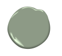
Olive Sprig by PPG- Olive Sprig PPG1125-4
Olive Sprig will give any room a classic and sophisticated approach. It’s the perfect choice for an elegant dining area or master suite.

Fernwood Green- 2145-40
If you want a neutral green color in soft and bright shades, then this paint color is perfect for you. This color will be great in living rooms and kitchens with yellow undertones.

High Park- 467
This medium tone green with blue undertones would work beautifully in kitchen areas, especially when paired with white cabinets. It’s a good subtle option if you don’t like to make bold statements in your décor choices.
RED

RED is also a very versatile color. It can be used in both warm and cool environments, and it goes well with a variety of other colors. If you’re looking for a color that will make a bold statement, red is definitely the right choice. It can boost your energy, make you feel passionate, and even increase your appetite.
Incarnadine – the comforting red
Incarnadine is inspired by the color of blood, as you can see from its vibrant red shade. This powerful, intense hue evokes feelings of passion and energy.

WildFlower – 2090-40
This palette consists of earthy tones with some vivid pops of electric contrast. Inspired by wildflowers, this dynamic collection plays on the rich hues found in nature.

YELLOW
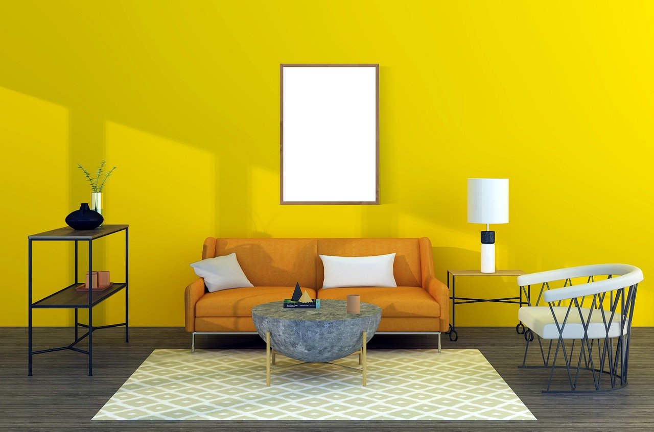
Interior designers often recommend yellow shades for walls because they create a cheerful and optimistic atmosphere. Yellow is the color of sunshine, and it’s often associated with happiness, joy, and energy. It can also be a calming color, which is why it’s often used in nurseries and similar spaces.
Babouche – the sunny yellow
This sunny yellow is a bright and cheerful shade that will give any space a fresh energetic boost. Ideal for living rooms, kitchens, hallways, and studies. Pairs extremely well with whites and gray tones.

Pale Moon- OC-108
This shade is an elegant and sophisticated tone that pairs extremely well with yellow. Ideal for bedrooms, bathrooms, lounge rooms, and studies.

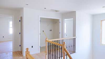
WHITE

When it comes to white shades, there are plenty of options to choose from. You can go with a cool white, which has a bluish cast, or a warm white, which has a yellowish cast. Cool whites are often used in offices and other professional spaces, while warm whites are often used in homes.
School House White – the updated neutral
Although white is typically thought of as a color with only one shade, there are actually many different shades of white. School house white is an off-white that blends in well with other colors and walls. It gives the appearance of being slightly gray without having too much green or yellow undertone to it.

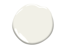
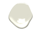
Steam- AF-15
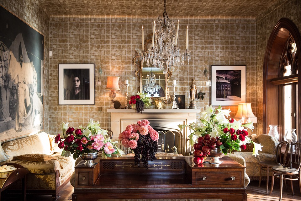
Steam – AF – 15 is a soft creamy off-white. This gentle yet sophisticated hue has a faint golden undertone for warmth and works beautifully on its own or paired with any color scheme. Perfectly accented by crystalline decor and modern silver finishes, this neutral will shine under candlelight and make your space feel rich, classic and elegant.
Natural Linen-966
Natural Linen is a beige with a touch of yellow and gray undertones. It works well with deeper colors such as shades of gray, brown and even deep shades of blue.

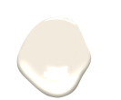
Collector’s Item- AF-45
Collector’s Item is a light off-white color which has a slight golden earthiness to it. When paired with dark furniture or black accents, this neutral stands out in the best way possible . This beautiful shade gives your space sophistication without being boring or too plain. The delicate gold makes this shade stand apart from other whites you might find at stores making it ideal for mixing with many different decor styles.
BROWN
Art and Craft by Dunn-Edwards: Art and Craft DET682
The color of warmth and earth. The shade between yellow ochre and sienna, brown is the essence of organic richness. It speaks to your roots and your sense of belonging.

Venetian Portico- AF-185
This shade is named after the grand columns that decorated Italian palaces during the Renaissance, and will bring the elegance and style of the era to your home.

GRAY
Gray shades are perfect for walls because they can make any space look bigger and more open. In addition, they can also be used to create a calming and relaxing environment. Popular gray shades are light grays, dark grays, and charcoal grays.
Morning Dew- OC-140
This shade of gray is perfect for spaces that are looking for a light and airy environment. It helps to create an atmosphere that is very serene. This shade of gray might be just the thing you need if you want your room to have some personality without being too bold or overwhelming.
Hint of Violet- 2114-60
This shade of gray can be used in rooms with strong earth tones to help balance them out. It will give off a vintage vibe making it feel like you stepped back into simpler times. This color is also great because it gives off depth without compromising space, which makes it ideal for narrow spaces such as hallways, staircases, etc.

Quiet Moments- 1563
This shade of gray can be used to create a very calming and serene atmosphere. It is the perfect color to use if you want your room to be relaxing. This color will make any space seem more spacious without sacrificing comfort or personality.

Gloucester Sage- HC-100
This shade of gray is probably the most versatile there is because it can be used with almost any color palette. Its softness makes it ideal for rooms that want an elegant feeling. It works with or without other earthy tones.

DARK
Dark colors can often make a room look more spacious and elegant. Dark colors can also be very luxurious and provide a feeling of sophistication and luxury.
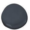
Mysterious- AF-565
Mysterious is a deep and rich color that looks stylish and elegant. Mysterious looks beautiful on interior walls of all colors. This color gives an impression of luxury and mystery.
CONCLUSION
Ultimately, the best thing to do when choosing interior colors is to choose the ones that you like best. Your home should reflect your personality, so go with paint colors that express who you are and why you love to call it home. The room’s purpose also has a lot to do with which color paint you choose. For example, an office should probably be painted in darker gray or black because mood-boosting colors like blue or yellow could make you lose focus on work. As shown in this article, different color values project different meanings onto the walls of homes; make sure to find what fits yours best.
The most important thing is to make sure the paint color isn’t too loud or bold. You don’t want it to overtake the rest of your home decor, but instead blend in nicely with everything else
For those who aren’t afraid to experiment with paint colors and personal style, try creating your own unique paint color recipe.
OnDemand Painters has researched all the top paint colors for you and collected the most interesting swatches from sources such as bhg, love remodeled, dwell, benjamin moore and country living. Be inspired!