Interior Paint Colors for 2024
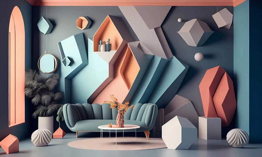
As we embark on a journey into the vibrant world of interior paint colors for 2024, get ready for a spectrum that’s as diverse as your imagination. This year’s color trends are a dynamic blend of emotion and style, offering a refreshing escape into a realm where every hue tells a unique story and transforms your home into a personal sanctuary.
From the deep olive shade that grounds you in nature’s tranquility to the exhilarating punch of blue nova, each color has been carefully selected to bring life, warmth, and personality into your living space. These trends are not just about aesthetics; they embody the latest in color marketing, reflecting a world that’s increasingly embracing the power of personal expression in every corner of home decor.
Check out our other guides on: Kitchen Paint Colors 2024, Exterior Paint Colors 2024 and Bathroom Paint Colors 2024
**Peach **
These shades are ideal for creating spaces that evoke feelings of joy and optimism, making them perfect for areas in the home where relaxation and positivity are key. Peach hues are a gentle reminder of the natural warmth and softness found in life, making them a nurturing choice for interior design.
Peach “Fuzz” by Pantone
Described as a velvety gentle peach color that enriches the heart, mind, and body. It seems to embody a spirit of nurturing and comfort, resonating with warmth and modern elegance.
Grays
These shades represent balance and neutrality, making them suitable for almost any room. The beauty of grays lies in their ability to provide a sophisticated backdrop for pairing accent colors, allowing for a dynamic yet cohesive interior space. As a primary color in the palette of interior designer favorites, gray holds a timeless appeal.
Light French Gray, SW 0055 (Sherwin-Williams)
This gray embodies the essence of modern elegance in interior paint colors for 2024. Its neutral tone harmonizes effortlessly with various design styles, representing a sense of stability and calm in life.
Drift of Mist, SW 9166 (Sherwin-Williams)
Chosen by many interior designers, Drift of Mist offers a serene backdrop, reflecting the vast blue sky in its subtle undertones. It symbolizes openness and tranquility, perfect for crafting a peaceful home environment.
Skyline Steel, SW 1015 (Sherwin-Williams)
As a warm greige, Skyline Steel is among the versatile color trends, blending well with both cool shades and warm toned colors. It represents the grounded neutral undertones of the natural world, bringing an earthy, comforting presence to interiors.
Jogging Path, SW 7638 (Sherwin-Williams)
This color, with its hint of green, evokes the deep olive shade of a serene forest path. Ideal for pairing accent colors, it symbolizes renewal and growth, embodying earthy tones that rejuvenate the spirit.
Whites
These shades represent new beginnings and a fresh start, making them ideal for spaces that require clarity and an uncluttered feel. White tones are particularly effective in enhancing natural light, creating an airy and expansive ambiance. Their versatility makes them a favorite among paint experts, as they complement a wide range of interior styles and other colors.
Snowbound, SW 7004 (Sherwin-Williams)
A crisp white, Snowbound is a welcoming color in the realm of interior paint colors for 2024. It symbolizes purity and clarity, offering a clean canvas for creative services in home decor.
Heron Plume, SW 6070 (Sherwin-Williams)
This soft white, with subtle violet undertones, is perfect for balancing depth in a room. It represents the alluring mid-tone between stark white and deeper hues, bringing a bespoke pale elegance to interiors.
Egret White, SW 7570 (Sherwin-Williams)
A warm, versatile white, Egret White is a color that harmonizes with a wide range of decor, symbolizing adaptability and balance. It’s a prime choice for those embracing consumer desire for warm neutrals in their homes.
Fleur de Sel, SW 766 (Sherwin-Williams)
This white, with a slight green undertone, evokes the calmness of a seaside retreat, perfect for coastal inspired blues in interior design. It represents tranquility and purity, much like the natural salt it’s named after.
White Dove OC-17 (Benjamin Moore)
A perennial favorite among paint experts, White Dove is a versatile and warm white. It represents peace and simplicity, making it a perfect choice for creating a serene and inviting space.
Pristine OC-75 (Benjamin Moore)
This clean and bright white offers a refreshing backdrop in any room. Symbolizing new beginnings and clarity, it’s ideal for those seeking a crisp, clean look in their home.
Blues
These shades symbolize tranquility, stability, and depth. The calming blues can transform a space into a serene oasis, perfect for rooms intended for relaxation and contemplation. From punchy blue to the more subdued light blue, these hues offer a connection to the blue hues nature offers, evoking a sense of peace and serenity.
Gale Force, SW 7605 (Sherwin-Williams)
This deep blue shade, reminiscent of blue nova, brings the drama of the ocean into the home. Ideal as an accent color, it symbolizes depth and wisdom, and its weighty blue hue makes a bold statement in any space.
Blue Nova 825 (Benjamin Moore)
As the color of the year, Blue Nova is a captivating blue that mirrors the infinite array of blue hues nature offers. It symbolizes expansiveness and serenity, akin to gazing into a vast blue sky.
Polar Sky 1674 (Benjamin Moore)
A light blue that captures the serenity of a clear morning sky, Polar Sky promotes relaxation and calm. It represents tranquility and openness, ideal for crafting a peaceful retreat in your home.
Browns
These colors are reflective of the natural world, embodying qualities of resilience and reliability. Browns are particularly effective in spaces where a sense of warmth and security is desired, making them ideal for family rooms or studies. Their natural affinity with materials like natural wood and vintage furnishings adds depth and character to any interior.
Sealskin, SW 7675 (Sherwin-Williams)
A rich shade of brown, Sealskin adds a luxurious depth to interiors. It represents the strength and resilience of nature, perfect for creating a grounded, earthy ambiance in a room.
**Dark **
These shades represent strength, elegance, and definitiveness. Black is particularly effective when used as an accent color, providing a striking contrast when paired with lighter shades or metallic accents. In the realm of modern elements and design, black adds a dramatic flair, making it a bold choice for those looking to make a statement within their four walls.
Tricorn Black, SW 6258 (Sherwin-Williams)
The definitive soft black, Tricorn Black is a classic choice for adding sophistication. It represents strength and elegance, pairing well with metallic accents for a modern twist.
Rock Bottom, SW 7062 (Sherwin-Williams)
This deep mossy green with gray undertones brings the essence of the natural world into the home. As a rich shade, it symbolizes growth and renewal, making it an ideal choice for those seeking to incorporate earth tones in their decor.
Diverse Colors: A Palette of Emotions and Style
The “Diverse Colors” collection for 2024 redefines interior spaces with a spectrum of hues that capture a range of emotions and expressions. These colors are carefully curated to bring life, warmth, and personality into homes, reflecting the evolving trends in interior design. Each shade in this collection is a testament to the power of color in creating atmospheres that are not only visually stunning but also emotionally resonant, making every room a unique and personal sanctuary.
Topaz 070 (Benjamin Moore)
An energetic color, Topaz is a vibrant choice that brings warmth and joy to spaces. It symbolizes optimism and energy, making it an ideal shade to uplift and invigorate a room’s decor.
Teacup Rose 2170-50 (Benjamin Moore)
This gentle pink hue adds a touch of romance and softness to interiors. It represents compassion and tenderness, perfect for creating a nurturing and comforting atmosphere.
Honeybee CSP-950 (Benjamin Moore)
Honeybee’s warm, golden tone brings a cozy, sun-kissed feel to interiors. Symbolizing joy and vitality, it’s a perfect choice for adding a touch of cheerfulness to any room.
Regent Green 2136-20 (Benjamin Moore)
A deep, rich green, Regent Green is reminiscent of the deep greens found in nature. It represents stability and growth, making it a grounding choice for interior spaces.
Hazy Lilac 2116-40 (Benjamin Moore)
This subtle lilac shade adds a touch of whimsy and creativity to spaces. It symbolizes imagination and gentleness, making it a great choice for inspiring creativity and calmness in a room.
Conclusion:
It’s essential to remember that while these shades represent the forefront of design innovation, the true essence of selecting the perfect paint color lies in finding what resonates with your personal style and comfort. Trends are a guide, a source of inspiration, but your home is your personal canvas. It’s a space that should reflect who you are, not just the latest fashion in home decor.
In the end, whether you’re drawn to the calming blues, invigorated by the punchy tangerines, or soothed by the earthy greens, the choice should be guided by what feels right for you. So, let the trends inspire you, but let your personal taste and comfort lead the way in creating a home that truly feels like your own.

Chris Heerdegen
Chris Heerdegen is the founder and owner of OnDemand Painters, a painting and finishing company serving six metro markets across the Midwest and Florida. With over 20 years in the industry since 2001, Chris built OnDemand around a simple idea: answer the phone, show up when you say you will, and do the kind of work that earns a review.
All Posts