


See Top Interior Paint Colors for 2024
When it comes to decorating your home, choosing the right interior paint colors can be tricky. With so many shades and hues to choose from, it can be difficult to decide which one will bring out the feeling you are aiming for in your space. In 2023, there is an array of exciting paint colors that homeowners can choose from when looking to freshen up their homes.
Whether you’re looking for a bold statement or something more subtle, there’s a wealth of colors to choose from. Red, orange, pink, yellow, brown, gray, blue, earthy tones, white, purple and neutrals are some of the most popular interior paint colors 2023.
No matter what color palettes you choose, make sure it reflects your own individual style and personality. With so many options available this year, you can create a unique look that will set your home apart from everyone else!
Read OnDemand Painters’ paint color trends report and see the paint colors that are popular for 2023.
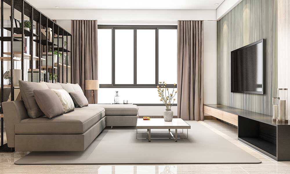
Pink
Pink is an interior color that has evolved from its traditional use as a feminine hued choice to one of the most popular choices for decor and home décor. Aside from being associated with femininity, pink also symbolizes love, sweetness and innocence. When used in a home setting, it can evoke feelings of comfort, warmth, and tranquility.
Viva Magenta by Pantone:
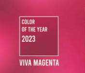
This bold pink is the Pantone Color of the Year, and brings a fearless and brave feeling to any home. It looks great as an accent color in combination with whites, grays, and other pastels.
Terra Rosa by Dunn-Edwards:
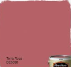
This deep, rosy-pink hue has a terra cotta influence and is perfect for creating a romantic atmosphere in any space. Try combining it with whites or soft pastels, such as coral or rose quartz, to create a soothing oasis.
Sherwin Williams by Redend Point:
A rosy brown that has undertones of red, brown, and blue. This color palette is ideal for creating a charming atmosphere in your home. It features subtle pink undertones, which can be used to bring warmth and softness to the space. To create a modern yet cozy look, pair this color palette with accents such as light wood furniture or bolder colors like teal or navy blue. You can also use neutral colors like gray or cream to create a classic look.
Raspberry Blush by Benjamin Moore:
This vibrant coral-tinged pink is sure to bring a charismatic feel to any space. It looks great with accents of blue, green and yellow for an eclectic look.
Yellow
Yellow is a warm and inviting color that brings brightness and cheer to any home. It’s a symbol of happiness and optimism, making it a great choice for interior design. Yellow can be used in all areas of the home, from bedrooms to living rooms. However, it works best as an accent color or when used sparingly on walls. This brings a subtle touch of cheerfulness without overwhelming the room.
Babouche by Farrow and Ball:
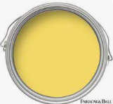
This cheerful yellow has h a hint of honey. Its warm hue adds an inviting energy to any home, making it the perfect choice for adding a touch of sunshine to a space. It pairs well with other bright colors such as light green and chrome yellow for an exciting contrast, or mid-tones such as buttercup for a more subtle and calming effect.
India Yellow by Farrow and Ball:
This is the perfect choice for a more dramatic shades look. Named after the well known paint pigment, it has a deep mustard yellow hue that is sure to make a statement in any room. When paired with whites and grays, this color can create an eye-catching look that will be sure to turn heads. It can also be paired with other earthy tones such as terracotta and brown for a more inviting atmosphere.
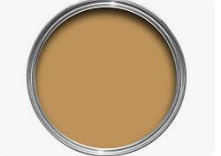
Light Gold by Little Greene:

This delightful, warm color is perfect for a cozy home. Its subtle golden hue adds a hint of opulence yet is still calming enough to be used in any space. When combined with other warm colors such as brown, orange and rust, this color can create a luxe look that is sure to be admired. It also pairs well with brighter shades such as chrome yellow for an exciting contrast.
Buttercup by Benjamin Moore:

This mid tone hue of pure yellow is perfect for adding a hint of vibrancy to any space. Its glow stick yellow undertones combine with its sunflower hue to make it perfect for adding a touch of energy and cheerfulness to any home. It pairs well with deeper tones such as dark blues and greens for an eye-catching contrast, or whites and grays for a more subtle effect.
Brown
Brown is a classic and timeless color that has been a popular choice for interior design for centuries. It’s a hue that is often associated with stability, luxury, and sophistication. Brown can give your home an air of warmth and comfort, making it the perfect color to create an inviting atmosphere in any space. Whether you opt for a dark and dramatic color or something more subtle and neutral, brown can be used to add charming and cozy appeal to any interior.
The best areas to use brown in are living rooms, kitchens, bedrooms, and bathrooms.
Cinnamon 2174-20 by Benjamin Moore:
A rich, warm brown with orange undertones. This color brings a cozy atmosphere to any room and accentuates other creamy hues and deep woods for a classic look. Paired with white or light beige accents, this shade can create an inviting interior that feels like home. Other complementary colors are tans, grays, and light blues.
Wenge AF-180 by Benjamin Moore:
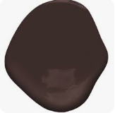
A dark chocolate hue with subtle hints of brown, black, and violet in the undertone. This color brings a bold yet sophisticated look to any room. Pair with white stone, dark woods, and metallics for a modern look. Alternatively, pair with muted teal greens or lighter tans to create an earthy atmosphere.
Ivory Brown 6006-1C by Valspar:
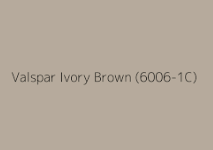
A creamy, ivory brown that pairs well with other neutral and pastel colors. This shade can add a gentle warmth to any room and be used with accents of blue, green, mauve or taupe for an inviting look.
Southern Road 1006-9c by Valspar:
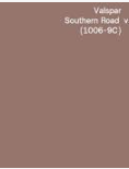
A muted clay color with brown undertones. This shade works best when paired with warmer colors, like mauve and dusty rose. Ideal for creating a calming atmosphere that brings warmth to any home.
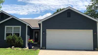
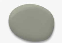
Gray
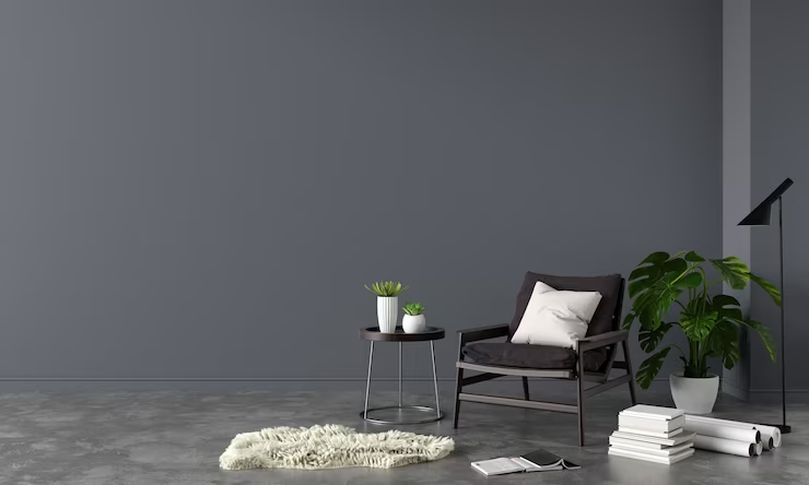
Gray is an interior color that is often associated with minimalism, elegance, and sophistication. It can bring a sense of calmness and neutrality to any space. Gray works best in contemporary settings like bathrooms, kitchens, or living rooms where its complementary nature helps create a unified look. The subtlety of gray allows for bolder furniture pieces or bright colors to stand out. Gray is also an excellent color for accent walls and can be used in any room to create visual interest with texture or pattern.
The New Age 1444 by Benjamin Moore:

This light purplish-gray shade is perfect for creating a tranquil and peaceful atmosphere. It will work best when paired with accents like whites and ivories to provide an understated elegance. To add some depth or pattern, incorporate jewel tones like emerald green, dark blues, and magentas for a dramatic touch.
Villa Grey 6005-1B by Valspar:
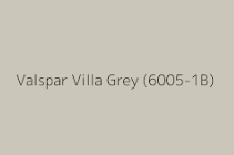
This light-to-medium warm gray hue is perfect for creating a calming and inviting atmosphere. To achieve the most effective results, pair it with whites or creams to make your space look larger and more airy. If you want to add some color,
deeper shades of red, blue, and green will provide the perfect contrast.
Clare Greige:
This warm and versatile shade is a great option for any room. It’s the perfect mix of gray and beige, making it easy to pair with almost any accent color. To bring in more warmth, try incorporating shades of yellow or gold. For a cool contrast, add hints of navy or cobalt blue. To create a homey feel, add touches of green and earth tones.
Campfire Ash by Behr:
This soft foggy gray has a cool green undertone that creates an airy, natural atmosphere. It pairs well with accents of pale pink and navy for a beach-inspired look or sage greens for a modern rustic feel. For the perfect neutral pallet, match it with crisp whites, warm tans, and touches of black. This color is perfect for a living room, dining room, or bedroom. It will instantly bring an inviting warmth to any space in your home.
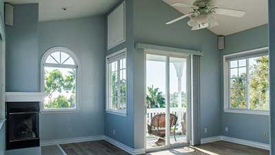
Blue
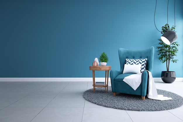
Blue is a calming, restful color often associated with the sky and oceans. It’s also seen as a symbol of loyalty and trustworthiness. For this reason, blue can be an ideal choice for interior walls in any space where relaxation or security is desired. In bedrooms and bathrooms, blue brings a serene atmosphere that encourages healthy sleep and peaceful rest. In office spaces, blue can create a sense of trust and productivity.
Starry Night Blue 2067-20 – Benjamin Moore:
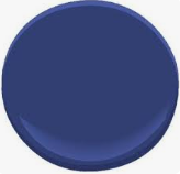
This deep navy color radiates a luxurious and sophisticated atmosphere. It makes a bold statement and pairs perfectly with lighter shades of blue, like sky blues or icy blues, for an ocean inspired look. For an even more dramatic effect, coordinating it with whites and grays is sure to create an elegant yet modern feel.
Rising Tide 4008-3A- Valspar:

This calming blueish gray creates a tranquil atmosphere and pairs perfectly with shades of white and light beiges. It is the perfect backdrop for highlighting other décor elements in the room, such as vibrant artwork or natural accents like plants. To add more depth to the palette, try coordinating with darker blues, or grays for a modern twist.
Hague Blue by Farrow & Ball:
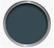
This deep, dark blue that creates an atmosphere of sophistication and elegance. It pairs well with lighter colors like ivory or pastel shades for a sophisticated look. This color will add depth to any room and create a stunning visual contrast if paired with bright whites, grays, and blues. Consider adding gold accents to give the room dimension.
Hale Navy by Benjamin Moore:
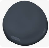
This navy color has a classic maritime feel to it, adding an updated and stylish touch to your home. Paired with whites, light blues, and grays, this navy can be used as a base color or as an accent. You can also create contrast with deep reds and other jewel tones for a beautiful effect.
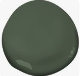
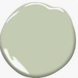
Green
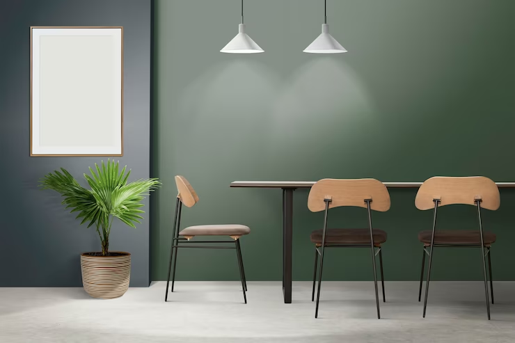
Green is widely known for its calming, refreshing qualities and its ability to bring a feeling of balance and harmony to any space. As an interior color choice, it creates freshness in a home’s design and provides the perfect backdrop for making other colors stand out. In terms of aesthetics, green paint is great for creating a cool atmosphere and can be used to make a space seem larger. For optimum effect, green is best applied to living rooms, dining rooms and bedrooms, as it helps create a tranquil ambiance in these areas.
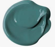
Farrow & North Sea Green 2053-30:

This deep and soothing teal color is perfect for any home looking to evoke a calming and relaxing atmosphere. Pair it with accents in light blues for a bright, airy look or mix in darker shades of blue and gray for an elegant touch.
PPG & Glidden Paint’s Vining Ivy:
This rich teal-bluish green hue will bring a sense of vibrancy and life to any space. Accent with shades of yellow for an energizing, cheerful look or choose neutral tones for a more toned-down palette.
Valspar Flora (5004-2C) Green Trellis 5006-3C:
This beautiful combination of green and teal is perfect for a home that wants to evoke the feeling of being in nature. Balance out the color with accents in shades of beige or white, or add pops of yellow or pink to really bring it to life.
Valspar Everglade Deck 5011-3:
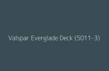
This soft and muted green hue is perfect for a subtle yet inviting atmosphere. Accent with lighter shades of beige or white, but don’t be afraid to add some bolder hues like blue or purple as well.
Evergreen Fog (SW 9310):
This neutral shade of green-meets-gray is versatile and calming. Pair it with lighter shades of beige or white to keep the atmosphere soft and bright, or mix in deeper hues like navy for a more moody look.
Spanish Moss by Krylon:

This dark green matte color is perfect for those who want to add a touch of drama to their space. Accent with shades of white and light grays to keep it classic, or add in pastel pinks and purples for a more vibrant look.
Benjamin Moore Boreal Forest:
This deep forest green is perfect for those looking for an inviting yet mysterious atmosphere. Choose lighter shades of beige or white for a subtle contrast, or mix in some gray and navy tones for a more modern look.
Benjamin Moore Budding Green:
This cheerful green hue will bring life to any space. Choose lighter shades of beige or yellow to keep the tone light and airy, or add darker accents like navy blue for a bolder look.
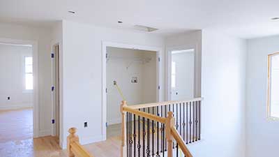
White
White is a classic and timeless color for interior design. It symbolizes purity, cleanliness and simplicity, making it the perfect choice for creating a tranquil atmosphere in your home. White can also make small spaces appear larger by reflecting light. This makes it ideal for use in living rooms and bedrooms where you want to maximize the available space.
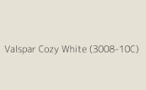
Cozy White 3008-10C by Valspar:
This cozy white color is the perfect choice for creating a feeling of comfort and warmth in any space. The warm neutral hue pairs well with many different colors, making it easy to find accent pieces that will fit your desired look. For a classic, timeless effect in your home, pair this shade of white with muted shades such as gray or beige. To add a splash of color and modernize your space, you can also pair it with bolder colors such as vibrant blues or reds.
Valspar Cozy White 3008-10C:
This cozy and inviting warm white that serves as the perfect base for many color combinations. It’s great for creating light and airy rooms, or adding visual interest to otherwise plain walls. Accent colors such as soft blues, sage greens, and muted yellows pair perfectly with this shade of white. This perfect combination will make any room feel comfortable and inviting.
Blank Canvas (DC-003):
This warm white shade is the perfect balance between gray and ivory, offering plenty of versatility. It can be paired with a variety of colors to create different looks and feels in your space, such as vibrant oranges or blues to add an energetic atmosphere. This shade of white offers a clean and inviting blank slate, which is great for adding a modern edge to any room and can provide a great backdrop for furniture and décor.
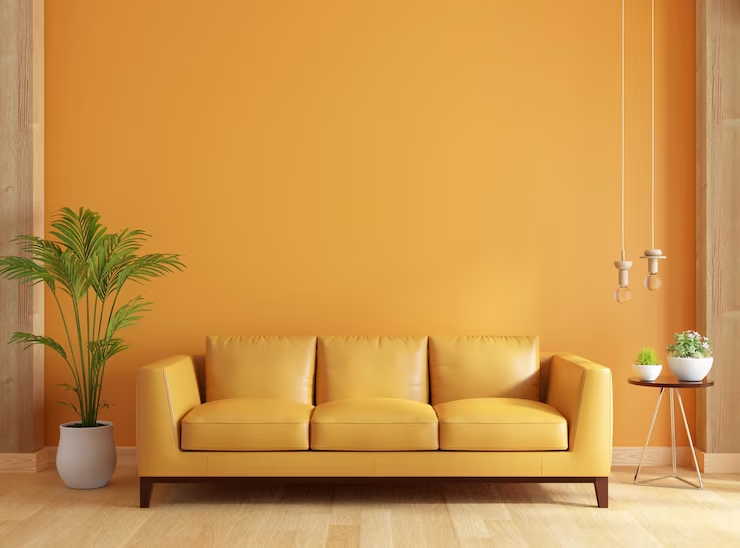
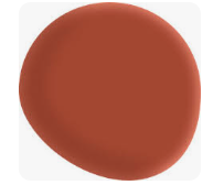
Orange

Orange is a bright, vibrant color that can bring a sense of liveliness and energy to any space. It is often associated with warmth and joy, making it an excellent choice for an interior paint color. Orange is perfect for creating cozy spaces where you can relax or feel inspired in your home.
It works best in living rooms, bedrooms, and dining rooms, as well as in children’s spaces or playrooms.
Canyon Ridge by Better Homes & Gardens at Walmart:
This mid-tone orange palette is inspired by the warm and inviting hues of a sunset. The light and airy tones bring a cozy yet contemporary feel to any room. Paired with complementary accents like mustard yellow, olive green, terracotta, and dusty pink, this color scheme will create an atmosphere of tranquility and comfort.
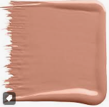
Desert Carnation 2005-7C by Valspar:
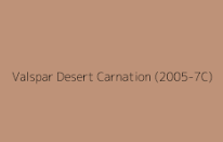
This deep, earthy palette is ideal for creating a space with an aura of rustic warmth and refinement. The colors in this range are reminiscent of the desert landscape and include hues like sage green, sandstone brown, terracotta, and taupe. Accents such as light gray and muted yellow can be used to add subtle contrast without detracting from the overall seasonal feel.
CONCLUSION
When it comes to choosing interior colors, it’s important to choose the ones that you like best. Your home is a reflection of your personality and personal style, and the colors you choose can have a significant impact on the overall ambiance of your space. By selecting a palette that resonates with you, you’ll create an environment that feels comfortable, inviting, and uniquely yours.
It’s also important to consider how the colors you choose will complement the walls and other design elements in your space. While you don’t need to be an expert in color theory, it’s helpful to have a basic understanding of how different colors interact with each other. You may want to experiment with different shades and hues to find the perfect combination that works for you.
OnDemand Painters has researched all the top paint colors for you and collected the most interesting swatches from sources such as bhg, hgtv, camille styles, southern living, and the nord room. Be inspired!